What an Honest AI Adoption Dashboard Looks Like
Most open with license count: a procurement number dressed up as a transformation metric. Here is what an honest dashboard drops, what it tracks instead, and why it is really a decision about your operating model.
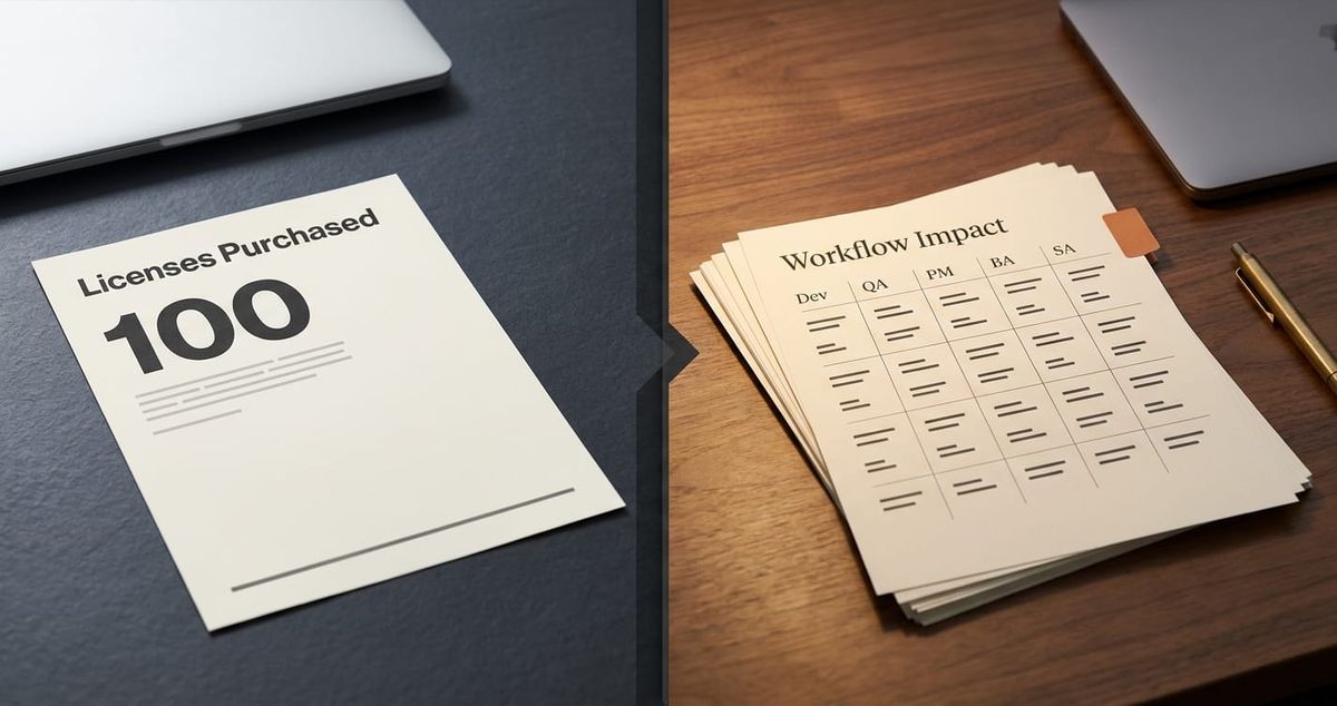
Most AI adoption dashboards I have reviewed with leadership teams open with the same number. License count. Sometimes it is dressed up as "active seats" or "enabled engineers", but the structure is the same: a procurement metric, presented as a transformation metric.
The dashboards are wrong in a specific way. They are not wrong because the numbers are inaccurate. They are wrong because the numbers cannot answer the question the leadership team is actually asking, which is whether the AI program is changing the way the company delivers work. License count was never going to answer that question. It was the easiest number to put on a slide, so it became the number on the slide.
I want to walk through what an honest dashboard looks like, what it should contain, what it should drop, and why the dashboard itself is a decision about the operating model rather than a BI artifact.
Most AI adoption dashboards are measuring procurement, not transformation.
The pattern is consistent. A company commits to AI transformation. Tools are bought. Roles are created or relabelled. Training sessions run. Six months in, the CEO asks the head of the program, in front of the board, what the dashboard says.
What appears is some version of:
- Licenses purchased.
- Licenses activated.
- "Trained users" (defined as "attended one session").
- Logins per week or per month.
- Sometimes a vendor-supplied acceptance rate ("X% of suggested completions accepted").
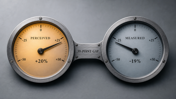
Every one of those numbers is a procurement signal. They tell you that money was spent, that accounts were provisioned, that people opened the tool. None of them tell you that the way work gets done has changed, and changing the way work gets done is the entire point of an AI transformation. This is the exact gap captured by the trigger phrase I hear inside delivery orgs more than any other: "Everyone is using the AI tools but I can't see it in our delivery metrics."
That phrase is the signal that the dashboard has failed at its job. The job of the dashboard is to tell the leadership team whether the operating model has changed. If everyone is "using the AI tools" and delivery metrics are flat, one of three things is true. Either the tools are not actually changing how work is done. The dashboard is measuring the wrong thing. Or both. In every case I have looked at, both are true at the same time.
So an honest dashboard, in the way I want to use the word here, is one whose every metric is defensible against this question: what does this number tell me about the operating model? If a metric cannot answer that question, it does not belong on the leadership dashboard. It might belong in a procurement report. It does not belong on the dashboard that the CEO and the board will use to decide whether the AI program is real.
License count, login count, and "trained users" hide the signal.
The reason these metrics dominate is not that anyone believes they measure transformation. It is that they exist on day one. The vendor exports license count and login count automatically. The training team exports attendance automatically. The dashboard is built from whatever data already exists, not from the data that would actually answer the leadership question. This is a structural problem with how AI dashboards get assembled, and it is worth naming because the same problem will repeat the next time a new tool category enters the stack.
The three procurement metrics each fail in their own way.
License count says nothing about whether the licenses are used. I have seen organisations where 70% of provisioned seats had not been opened in the previous month. That is not adoption. It is shelfware with a budget line.
Login count is slightly better, because it requires the person to have actually opened the tool, but it is still a presence signal, not a behaviour signal. A senior engineer who opens Copilot once a week to satisfy a tracking dashboard and then ignores its suggestions is counted the same as one who has rewritten their daily workflow around it. Logins flatten that distinction. The dashboard cannot then tell you that the second engineer's PRs look different from the first engineer's PRs, because logins are the highest resolution it has.
"Trained users" is the weakest of the three. Training attendance is correlated with future adoption only when training is followed by reinforcement, role-specific playbooks, and a delivery system that expects AI to be used. Without those, training is a one-time event that decays in weeks. Counting attendees and presenting that number as adoption is the dashboard equivalent of counting how many people opened an email and calling it engagement.
The cost of these three metrics dominating the dashboard is not just that they tell you nothing. It is that they create the appearance of progress at the leadership table, which delays the moment the leadership team realises the program is not working. That delay is expensive. It is measured in quarters, not weeks.
Workflow-impact metrics are the only ones that survive board scrutiny.
The metrics that belong on the leadership dashboard are the ones that map to the workflow the AI is supposed to change. They fall into three categories, and an honest dashboard has all three.
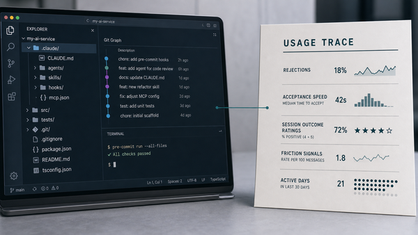
The first category is behavioural metrics. These measure whether people are actually doing the new work in the new way. The simplest example is the AI-assisted task ratio: of the tasks completed this sprint, what percentage involved a documented AI step in the workflow? This requires the workflow to be redesigned so that AI use is captured as part of the artifact, not as a separate survey question. A PR template with an "AI tooling used" field is a behavioural-metric primitive. So is a story template with "AI-prepared brief attached: yes / no." The behavioural metric is what tells you whether the role-level redesign has actually happened, or whether the team is doing the old work and quietly using the new tool on the side.
The second category is delivery metrics. These measure whether the behaviour change has translated into output change. Story implementation time, bugfix time, reopened ticket rate, PR size, review-time-to-merge, and cycle time all sit here. These are the metrics the engineering org has tracked for years, but they take on a different meaning when the dashboard also shows the behavioural metric next to them. If the AI-assisted task ratio is rising and cycle time is dropping, the program is working. If the AI-assisted task ratio is rising and cycle time is flat, the bottleneck has moved somewhere else and you can see exactly where. If the AI-assisted task ratio is flat and cycle time is dropping, you have an improvement that is not driven by AI and you should not credit the AI program for it.
The third category is quality and risk metrics. AI adoption can quietly degrade quality long before it shows up in the delivery numbers. Reopened tickets, post-merge defect rate, regression suite coverage delta, and incident frequency all sit here. The dashboard needs them because an AI program that is improving cycle time and degrading quality is a program that is borrowing speed against a debt that will be paid by the customer or the support team three quarters from now.
Each of these categories is workflow-impact. Each one is defensible against the question "what does this tell me about the operating model?". A board update that opens with these numbers, rather than with license count, can survive the follow-up questions.
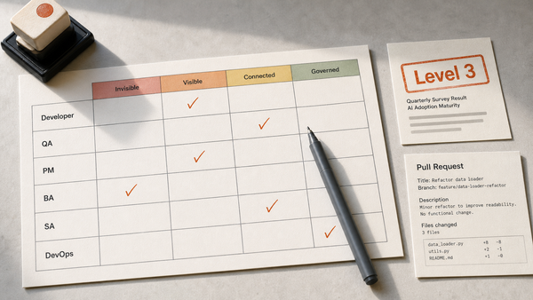
The per-role metric map runs across Dev, QA, PM, BA, and SA.

The single biggest jump in dashboard quality comes from refusing to aggregate across roles. AI changes Dev work differently from how it changes QA work, and both differently from how it changes PM, BA, or SA work. A dashboard that reports "AI productivity" as one number across all of delivery has averaged away the signal. The right shape is a per-role section, each one with two or three load-bearing measures. The measures should map to the per-role L1–L4 framework set I have documented for delivery teams, so that the metric tells you not only that AI use is happening but at what level of role maturity. This is the role-level redesign question rendered as numbers.
For Dev, the load-bearing measures are AI-assisted commit ratio, PR size distribution shift, review-time-to-merge, and post-merge defect rate. The first two measure behaviour. The second two measure delivery and quality. A Dev team genuinely at L2 or above will show a rising AI-assisted commit ratio. It will show a PR size distribution that tightens, with smaller and more frequent PRs. It will show a shorter review-to-merge time, and a stable or improving post-merge defect rate. A Dev team where the dashboard shows rising AI-assisted commits and rising defect rates is in a different position; the dashboard is doing its job by showing this clearly.
For QA, the load-bearing measures are AI-assisted test-case generation ratio, automated suite coverage delta, defect detection time, and escaped-defect rate. QA adoption is the one most commonly missed by license-count dashboards, because QA teams often share licenses or use embedded tooling, and the procurement signal vanishes. The behavioural metric is what surfaces what is actually happening. It shows whether the QA team has redesigned its test design and execution flow around agent-generated tests, or whether it is still hand-writing the same test cases and using AI for documentation polish.
For PM, the load-bearing measures are story-prep time, scope-change rate, AI-prepared brief ratio, and stakeholder-response time. PMs are an instrumented-late population for AI dashboards, in my experience, because PM work is harder to measure than Dev work and most metric programs default to the things engineering already tracks. The PM section of the dashboard is what tells you whether AI has actually changed how requirements come into the delivery system, which is upstream of every other metric.
For BA, the load-bearing measures are requirements clarification time, acceptance-criteria rework rate, AI-assisted user-story draft ratio, and downstream defect rate traced to requirements. The BA section is where the dashboard catches the upstream-quality story: if BAs have raised their clarification game with AI, you should see fewer requirements-traced defects emerging in QA. If you do not, BA adoption is procurement, not transformation.
For SA, the load-bearing measures are option-evaluation throughput, non-functional-requirement coverage on new designs, design-review iteration count, and design-related rework downstream. SA adoption is the easiest to fake. Architects can produce diagrams with AI assistance and look highly adopted without changing how the design decisions themselves are made. The metrics here are designed to surface whether the architectural reasoning has actually expanded under AI, or only the deliverable speed.
The per-role section is also where the dashboard becomes useful for managers, not just for executives. A delivery manager looking at the Dev quadrant and the QA quadrant side by side can see whether the team's bottleneck has moved from coding to test design after AI introduction. That is a workflow conversation, not a tools conversation. The dashboard is now doing what a dashboard is supposed to do, which is direct attention to the part of the operating model that needs the next decision.
Leading and lagging metrics each tell you a different thing.
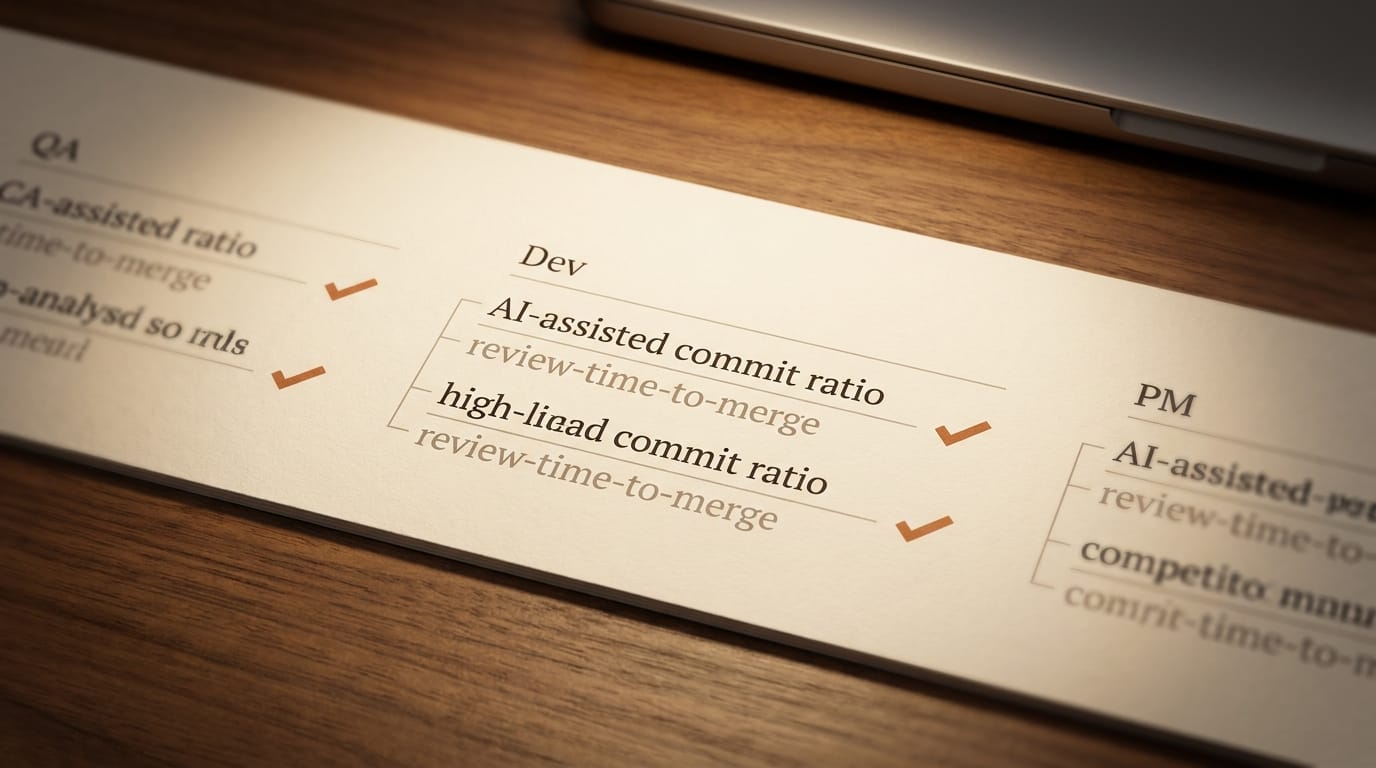
Once the dashboard has behavioural, delivery, and quality categories, plus a per-role section, the next question is how each of those metrics behaves over time. Some of them are leading indicators. They change first, when behaviour shifts. Others are lagging. They change later, when the behaviour shift has worked its way through to outcomes.
The behavioural metrics are leading. AI-assisted task ratio, prompt depth, AI-prepared brief ratio, and AI-assisted commit ratio move first, because they directly reflect the behaviour the program is trying to produce. They move within weeks of a role redesign, if the redesign actually lands. They are also the metrics most exposed to self-report drift, which is the next section's problem.
The delivery metrics are mostly lagging. Cycle time, story implementation time, bugfix time, and review-time-to-merge are downstream of the behaviour change. They typically take one to two full delivery cycles to move, because the behaviour has to actually run through enough work for the data to stabilise. Reading delivery metrics in the first six weeks of an AI program is a category error; the metric is not yet sensitive to what the program is doing. Most dashboards I have seen confuse this period with "the program is not working" and either pivot or expand prematurely.
The quality and risk metrics are the slowest. Post-merge defect rate, regression coverage delta, and escaped-defect rate take a full quarter or more to settle, because defects take time to surface in production. An honest dashboard names this latency explicitly, so that no one reads "quality is fine" off two weeks of data.
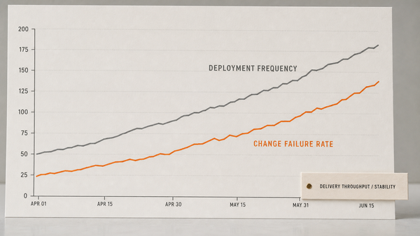
The reason both leading and lagging metrics must be on the dashboard is that they do different work. Leading metrics tell you whether the program is acting. Lagging metrics tell you whether the action is producing the outcome you wanted. A dashboard with only lagging metrics, which is the default shape of every engineering dashboard I have inherited, can only diagnose programs after they have failed or succeeded. A dashboard with both can diagnose them while there is still time to change them.
A practical rule I use: every leading metric on the dashboard should be paired with the lagging metric it is supposed to drive, and the pairing should be visible on the same screen. AI-assisted commit ratio sits next to review-time-to-merge. AI-assisted test ratio sits next to escaped-defect rate. AI-prepared brief ratio sits next to requirements-traced defect rate. The pairing is what makes the dashboard a diagnostic, not a celebration.
The dashboard itself has four failure modes.
Even with the right metric categories, the right per-role split, and the right leading-lagging pairing, the dashboard can still mislead the leadership team. Four failure modes show up consistently in the dashboards I have reviewed.
The first is Goodhart instrumentation. When a metric becomes the target, it stops being a good measure. If AI-assisted commit ratio is what determines whether the program is "working" in the eyes of the CEO, engineers will produce AI-assisted commits, including for changes that do not require AI assistance at all. The metric stops measuring what it was supposed to. The defence is to keep the leading metric paired with its lagging metric and treat any divergence as a signal that gaming has begun.
The second is manager-gaming. Mid-level managers in roles whose teams are not adopting AI well will sometimes filter the data. They adjust reporting boundaries, recategorise tasks, or exclude certain projects from the dashboard, so that their section of the report looks better. This is not malice. It is rational behaviour under a poorly-designed incentive. The defence is to keep the raw data definition fixed at the leadership level, audited, and visible to roles outside the manager's team.
The third is self-report drift. The most common form of this is the AI-adoption survey: an internal survey that asks people how often they use AI in their work. Self-report numbers consistently drift upward, because people overestimate their own AI use, especially when they sense the leadership team wants the number to rise. The defence is to never use a self-reported metric as a primary signal. Behavioural metrics extracted from actual workflow artifacts, the PR, the story, the test plan, are slower to instrument but harder to drift.
The fourth is the license-utilization proxy. This is the trick where "active user" gets defined as "logged in once in the last 90 days," and the dashboard then reports a high active-user percentage. It is the procurement metric returning in disguise. The defence is to write the definition of every behavioural metric into the dashboard itself, in plain language, so that anyone reading the number can see what it actually measures.
Each of these failure modes is structural, not personal. They will appear in any dashboard that does not actively defend against them. Naming them at the time the dashboard is designed is cheaper than discovering them when a board update collapses under follow-up questions.
A short diagnostic surfaces whether the current dashboard is doing its job.
A diagnostic worth running on the current dashboard, before any new metrics are added, is five questions long. The five questions are not a maturity model. They are a fast read of whether the artifact in front of the leadership team is fit for purpose.
The first question is whether the dashboard distinguishes procurement, behaviour, and outcome. If every metric on it is one of those three categories, the dashboard is structurally sound. If two of them are missing, the dashboard cannot do its job. A dashboard composed entirely of procurement metrics is the most common failure I see.
The second question is whether the dashboard has a per-role section. If "AI productivity" is reported as one number across delivery, the dashboard has averaged away the signal. The per-role split is what makes the dashboard actionable for managers.
The third question is whether each leading metric is paired with the lagging metric it is supposed to drive. If they are reported on different screens, in different sections, by different owners, the dashboard cannot show the pairing. The diagnostic moves with the data, not with the metric.
The fourth question is whether the dashboard has explicit controls against its four failure modes. Goodhart-instrumentation defence: are leading metrics audited against their lagging partners? Manager-gaming defence: is the raw data definition fixed at the leadership level? Self-report-drift defence: are any primary metrics self-reported? License-utilization defence: is every metric's definition written into the dashboard? A dashboard with none of these controls is a dashboard waiting for an embarrassing follow-up question.
The fifth question is the one the CEO actually wants the answer to. For each metric on the dashboard, can the owner answer "what does this number tell me about the operating model?" in one sentence? If the answer is "it tells me people are using the tool," the metric is procurement. If the answer is "it tells me that the behaviour we wanted to install has reached X% of the workflow and is moving the downstream outcome," the metric belongs.
This is not a four-level maturity ladder. The maturity ladder is a separate piece of work, and the artifact-based rubric for evaluating individual roles is another. This diagnostic is shorter. It is meant to be runnable in one sitting, with the current dashboard open on a screen, by the person who has to defend it next.
The dashboard is an operating-model decision, not a BI artifact.
The reason an honest dashboard is so hard to assemble is that it is not really a BI task. It is an operating-model decision rendered as numbers. The choice to put behavioural, delivery, and quality metrics on the dashboard, split by role and paired leading-to-lagging, is the same choice as the choice to run the AI program as an operating-model change rather than as a tool rollout. The dashboard reveals what the leadership team thinks AI is for.
A leadership team that has accepted that AI is an operating-model change will build a dashboard that asks role-level, workflow-level, and quality-level questions, and will tolerate the slower instrumentation that requires. A leadership team that has not yet accepted that, or that has accepted it in language but not in practice, will keep defaulting to procurement metrics, because they exist on day one and they do not require anyone to redesign the workflow to capture them.
The companion piece to this article on the AI Adoption Maturity Ladder describes where teams sit on the journey from no AI to integrated AI, and the per-role rubric in the 4-Level AI Adoption Evaluation Model gives the artifact-grounded test for individual roles. Both of those exist because the dashboard alone is not enough. The dashboard tells you what is changing, the ladder tells you where you are, and the rubric tells you whether the change is real for any given person. The three artifacts together are how a leadership team can move from procurement reporting to transformation reporting.
What I would not do, with the current dashboard, is add metrics to it. Most of the dashboards I have reviewed are already overloaded. What they need is not more lines but a more honest selection. The first move is to ask, for each metric currently on the screen, what it tells you about the operating model. The metrics that survive that question stay. The metrics that do not, leave. After that selection, the per-role section gets added, then the behavioural-lagging pairings, then the failure-mode controls. The dashboard at the end of that work is shorter than the dashboard you started with. It is also, for the first time, in a position to tell the leadership team what the AI program is actually doing.
The cost of doing this work is small, compared to the cost of presenting another quarter of license-count and login-count metrics and watching the board lose patience. The dashboard is the artifact that decides whether the next quarter of AI investment is well-spent or wasted. An honest dashboard makes that conversation possible. A procurement dashboard, dressed up as a transformation dashboard, postpones it until the postponing is no longer affordable.
Holding the dashboard to artifact-grounded evidence like this is the lens Shift Harness applies.
AI Transparency Notice: This article and its accompanying images were created with the assistance of generative AI. The author directed the content, contributed the underlying ideas and analysis, and reviewed the final publication.